Tuesday, December 31, 2013

MobileHippo 2013: That's a Wrap!


Hello everyone,

We’ve made a lot of great progress over the last year to improve your MobileHippo experience. Here are a few things you may have missed.

Yes, you are getting that much traffic from mobile. MobileHippo's new Activity page will show you total page views, which pages receive the most traffic, which mobile devices are viewing your site the most, and how often your QR codes are getting scanned.

Navigation, navigation, and more navigation. We introduced new navigation options like Images, Icons, Buttons, and Tile Menus. Not only that, you can now customize individual navigation items with icons and background colors.

Facebook, Google+, Instagram, and Flickr photo albums. Using our new photo album widgets, you can add photos to your favorite social media site, and they will automatically be added to your mobile site.

Restaurant menus and hours. Enter your menu and hours on Locu, and publish them on your website, mobile site, and across the web. MobileHippo’s Locu widget will automatically update your mobile site whenever you update Locu.

Mobile data collection. Turn your forms into mobile web apps. MobileHippo’s form builder received multiple upgrades this year with the addition of Auto Numbers, Find Me (Geolocation), Hidden Fields, and Restricted Access.

Thanks to you, we’ve had a wonderful year. We look forward to 2014. Happy New Year from all of us at MobileHippo.

The MobileHippo Team
www.mobilehippo.com

Wednesday, December 11, 2013

Your #1 Priority Needs to be Building a Mobile-Optimized Website

It wasn’t that long ago when having a website was unnecessary. People looked up businesses using the phone book, and asked friends and family for recommendations. Businesses promoted themselves by advertising through traditional channels (like mailers, flyers, billboards, television ads, and magazine ads), or earned new business through word of mouth referrals. It was a simpler time, but then came the Internet.


The website revolution

At first, many business owners wanted a website simply because their competition had one, but they didn't understand how to take advantage of it. Over time, however, the Internet became more and more significant, and business owners saw increased sales as a result of their online presence. Today, most businesses can’t survive without their website. If you want to succeed nowadays, even as a small, local business, a website is generally a must-have. The same change is now taking place with mobile technology.

The mobile revolution

In the beginning, mobile phones were just like ordinary phones, but without the cord. Today, we’re all walking around with miniature computers in our pocket. And with the rise of smartphones, consumers have eagerly made the switch from desktop browsing to mobile browsing. In some industries, over half of the Internet traffic already comes from mobile devices. And even where the 50% mark hasn’t been exceeded, it’s trending in that direction.

So, why is this a big deal? Well, if your website isn’t mobile-optimized, you might as well not have one at all when it comes to mobile visitors. Sound extreme? Studies of user behavior show that if a site isn’t mobile-optimized, most users hit the back button and rarely return. Instead, they head to competing websites and bring their business with them.


Identify what mobile consumers need the most when they interact with your business, and build a mobile-first, not desktop-lite (responsive) destination. If your website isn’t mobile-optimized, you simply “don’t exist” to what will soon be the majority of users. It’s a harsh reality, but there’s also a huge opportunity to get ahead.

Think mobile-first

You wouldn’t depend entirely on the phone book for your business, right? Mobile is coming to be the same way. Depending solely on a website that isn’t mobile-optimized is a very costly mistake, and these losses will only grow in the coming year. For that reason, when it comes to the Internet and digital marketing, your #1 priority needs to be building a mobile-optimized website. Your customers are already mobile. Are you?

Ready to go mobile? Click here to get started today.

Monday, August 26, 2013

Do more with mobile.™

Hello everyone,

MobileHippo is working hard to improve our platform and bring you the greatest features available on the mobile web. These are just some of the new features available with MobileHippo.

Navigation, navigation, and more navigation

Slideshow transitions and shuffle


Social media icons


Facebook, Google+, and Flickr photo albums


Google Calendar


Restricted access


If you have any questions please contact the swamp at support@mobilehippo.com.

Thanks for all your feedback and support!

The MobileHippo Team
www.mobilehippo.com

Wednesday, June 5, 2013

Featured Mobile Website: The Opera House


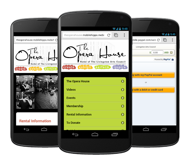
The Opera House,  an arts and cultural events center in Howell, MI, was built in 1881. Today it embraces its history while also adapting to current technology and social trends.  Making their website mobile friendly became a priority when they realized that people were visiting their website on smartphones.   Oh how life has changed over the last 132 years- the very first people that went to the Opera House didn’t even have a telephone and came by horse and buggy.

Why We are Featuring This Site:

The Opera House’s site delivers a mobile experience that people will appreciate.  This mobile site uses many MobileHippo features, and as a result, the  site is easy to navigate and perfect for smartphone users.  Throughout the site,  there are several action buttons and videos that encourage visitors to interact with them.

Our Favorite MobileHippo Features Utilized:

The Opera House used the YouTube video widget to install several of their videos in strategic locations on the site.  We love how they want their visitors to engage with their content on the mobile site and gain an appreciation of the history behind The Opera House.  They also took advantage of MobileHippo's ability to add a PayPal Donate button to your mobile website to enable their visitors to easily support The Opera House and help to maintain the historical relevance of their building.

MobileHippo Food:

Most businesses today are not mobile friendly, mainly because they just don’t realize that people are looking for their company on smartphones at this very moment.  Businesses must consider how their customers are engaging with them, and many of those customers are using their smartphones to do it.  Why not give those customers a  mobile experience that keeps them coming back to you instead of one of your competitors who is mobile friendly?

Friday, May 24, 2013

Mobile Website of the Week: Munro Landscaping


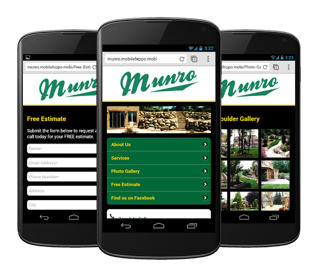
It’s time again for the mobile site of the week, just in time for the holiday weekend. We know that many of you will be spending the weekend, or part of it, doing yard projects for relaxation. So, in the spirit of this weekends activities, we wanted to showcase the Munro Landscaping mobile website.

Why we like this site:

Munro Landscaping does a great job here of getting content to its customers that they can use on the go. Their mobile site is clean and sharp, just like the landscaping work that they do. They have multiple image galleries that showcase their beautiful landscaping projects so you can make that decision to give them a call, instead of doing it yourself on these holiday weekends. And by the way, they make it easy to contact them because they have a big touch to dial button right on the every page of the mobile website.

Thursday, May 9, 2013

Why Restaurants Need a Mobile Website


Customers are looking for you, and your menu, on their smartphones.  If you’re not targeting these people, you’ve probably already lost customers to a restaurant that does.  It’s no secret that there’s a mobile explosion underway, and Google reports that 94% of smartphone users look for local information on their phone, and 90% of those take action as a result.  In order to make their experience as inviting as possible,  your restaurant needs a mobile-friendly website.  MobileHippo enables you to build a mobile website that will help you attract customers and interact with them to keep them coming back. MobileHippo has numerous features that will engage your customers and make it easy for them to find the information they need.

Restaurant Features

  • Easy-to-view navigation and text
  • Menu builder
  • Touch-to-Call phone number
  • Driving directions
  • Hours of operation
  • Social media integration
  • QR code generator
  • Image galleries
  • Deals and coupons
  • Text marketing integration


How Do I Know If It Is Working for Me?


MobileHippo's activity reports enable you to view which pages are the most popular on your mobile website,  and which devices are being used to view your mobile website. If you're taking advantage of MobileHippo's QR code generator, our activity reports will even show you how many times your QR codes are getting scanned. This, coupled with Google Analytics will give you the ability to see the positive effect your mobile website is having on your restaurant.

MobileHippo’s mobile website builder enables do-it-yourselfers to quickly and easily create a mobile-friendly website. Too swamped to build it yourself? One of our mobile design experts can build it for you. Either way, your restaurant will benefit from serving customers on the go.

Friday, April 26, 2013

Mobile Website of the Week: Image Business Solutions

Mobile Website of the Week
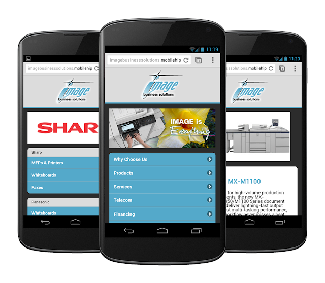
Image Business Solutions is one of Southeastern Michigan's leading suppliers of office automation products including digital copiers and printers, faxes, network printers, imaging, scanning and document management systems.

Image Business Solutions features a mobile-friendly navigation that allows you to quickly and easily browse entire product lines, view images, and read detailed product descriptions. Do you have a question about which product is right for you, or do you need support with your existing equipment? Help is literally at your fingertips. Tap one of the Touch-To-Call buttons located at the bottom of each page to call Image Business Solutions.

Making your customers alternate between scrolls and zooms on mobile devices can get pretty frustrating. It's time to make your website mobile friendly.